Showing posts with label artist. Show all posts

Sunday, 11 November 2012

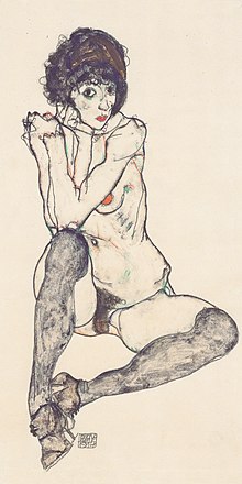
Egon Shiele and his use of line

Meghan Quigley
Meghan Quigley
Egon Schiele

I have been making a lot of drawings recently and framing some work that I  have made previously. I love Egon Schiele, and recently I have been receiving a lot of comments that our styles are similar (which I'm very happy about!) I love the contrasting use of angular sharp and curved lines to depict the human form, as well as the controversial hyper-sexualisation. 

He has long since been an inspiration for my love of linear drawings and depicting the human form!


Thursday, 21 June 2012


Hello,

I will be exhibiting work at the Festival of the Erotic Arts in Edinburgh (22nd - 24th June 2012), if you are in town, please pop down and have a look! Should definitely be an experience :)

Visit: their website for further details.

Friday, 2 December 2011


Visited GOMA and was really intrigued by their current exhibition upstairs, downstairs featured a contemporary survey of sculpture featuring Karla Black and Andrew Miller amongst others, however, the video art upstairs blew me away.

Exhibition: Videonale.13 (Festival for Contemporary Video Art 2011)


Reynolds Reynolds
Six Easy Pieces

Image still from:
Six Easy Pieces
Length: 10min
Format: 16:9

(Originally exhibited in Germany, 2010 using 3 channels of HD video transferred from 16 mm and photo stills)

Six Easy Pieces is the last part of the Secrets Trilogy; a three-part cycle exploring the imperceptible conditions that frame life. According to Reynolds Reynolds website, the work is based on the book, “Six Easy Pieces: Essentials of physics explained by its most brilliant teacher” by Richard P. Feynman
The imagery was very fluid, almost like watching dancers, which was interesting because scientific and medical imagery were quite prominent. The filming itself is fascinating, the models actually look like they're vibrating and I'm wondering if it is because each frame is made up of thousands of images? Possibly, I just can't work it out yet. Use of sound was also very significant, it was the heart beat of the piece.

Following excerpt taken from the Videonale's website


Time is the elusive entity that quietly percolates through our fingers. We have to impose a rhythmic order upon our existence – the sound of a clock, music with its beats and pauses, the ticking of machinery – since only this order allows us to sense the pulse of time as it flows. Reynold Reynolds uses “Six Easy Pieces: Essentials of Physics Explained by Its Most Brilliant Teacher”, a book by renowned physicist Richard P. Feynman as the scientific foundation for his artistic exploration of the issue of time. The artist juxtaposes imagery of scientific inquiry various measuring instruments and chemical equipment with organic matter, fish, flowers or with a human body, whose life span will inevitably come to an end, despite all of humankind’s scientific achievements. The video is inundated with traditional symbols of memento mori: mirrors that hint at the transitory nature of beauty; books that stand for the vanity of knowledge or a roulette wheel that reminds us of  the unpredictable nature of life and death.
Reynolds, a former physicist himself, mixes together imagery of transformation and decay to stimulate the viewer's contemplation of the issue of time and to show that artists and scientists often prove to be accomplices in the process of making sense of the world.
OC

Interview:

► 1. Your video has been chosen among over 1700 festival entries to participate in Videonale 13. How central the video medium to your overall artistic production? Is it complimentary to other media you use or do you work exclusively with video?

I work with 16mm film and transfer it into digital stills that exist in the computer and shoot digital stills with a stop motion technique.

► 2. Is there a particular theme, concept or problem your art addresses the most?

Time and Space and the depiction of Time and Space.

► 3. What artists do you relate to or find significant for your own art-making?

Eadweard Muybridge, Marcel Duchamp, André Breton, and Stanley Kubrick for the dead artists.
The living ones: Robert Frank, Pierre Huyghe, David Lynch, and Miloš Forman.

► 4. Do you think the video medium can address social or political issues better than other art media?

It is the best medium for propaganda.

► 5. Art can be seen as a mirror that registers and reflects life or as a tool that transforms it. Which of the two positions is close to your own art-making philosophy?

As a mirror of the maker and viewer. Art can also register dead things; machines, corpses, not just life.

► 6. How do you understand success in an art-making career?

Making work that ages well.

► 7.What is the most difficult and the most rewarding thing about making art / being an artist?

The way people look at you when you say you're an Artist.

► 8.What are your upcoming projects?

A 1930's Berlin Film.

► 9. What do you do when you don't make art?

See art shows, watch movies, fill out forms.

Tuesday, 29 November 2011


Currently reading and researching the topic of digital culture and its influence on behaviour/our psyche as part of my FOCI dissertation. 

 For my work in the studio, I see parallels in terms of what is seen as a positive reworking and re-imaging of identity, particularly in postfeminist discourse that can be counter-balanced by the distortion of an authentic self and essentially, escapism into an inhuman age. Lanier is fascinating in that he really pinpoints the problems with using technology to think, in that, we no longer have to. He focusses on trying to rebalance the way we interact with technology, but barely touches on the implications of this interaction - are we using online spaces and the Web 2.0 in order to perform ideal selves and overcome the fear and isolation of our bodily existence?

This is not a new theory, I doubt.  In 1911, Russian scientist Konstantin E. Tsiolkovsky-Kaluga predicted,  
"Mankind will not remain bound to the earth forever."

I worry about this a lot. in a recent crit, a student commented (in response to a video piece I made in which a girl pulls leaves and plant life from her mouth repeatedly) "It could be anything coming from her mouth but it would still be disturbing" but I fully disagreed. We are not plant matter. The symbolic ties that plants have (life force, nurture etc.), we do not co-exist with.
 I think that is one of the main reasons I am so preoccupied with natural, pastoral imagery, maybe I'm nostalgic or desiring a different era but this type of imagery is vital for my practise. 

Monday, 28 November 2011


Stumbled upon this person/tumblr - they provide no details as to their identity.
She is an illustrator, with a particularly interesting process of working, using line and tone to express mood (the piece below is an example of which), I think it would be interesting to explore this process further but in my a more non-representational way. Also, in terms of presentation - I really like her clean cut website.
 Just a record for me to follow her really.


Sunday, 27 November 2011


We visited the BALTIC in Gateshead, Newcastle - the current exhibition highlights the Turner Prize Nominees for 2011. I've blogged previously about Sarah Lowndes great discussion about the amount of Scottish artists nominated/winners of the Turner Prize but it was lovely to be able to see the work in the flesh.


The stand out piece for me was Carla Black's installation.


Hilary Llyod
I definitly found her first video piece very comical, it was a bit like buildings playing jack in the box with the viewer. She combines still and moving images, sound and the three dimensional forms of AV playback equipment to portray the urban environment.


Mike Kelley and Michael Smith.
Not in the Turner Prize but pretty jaw dropping, there was a huge immersive installation on the top floor, "...a collaborative installation between renowned American artists Mike Kelley and Michael Smith. A Voyage of Growth and Discovery sees the man-child Baby IKKI, a character developed by Smith for over thirty years, navigate the infamous Burning Man festival in the Nevada desert. Alone in his journey amongst thousands of revellers, IKKI negotiates the primal elements of fire, water, earth and wind. A six-channel video installation replaying IKKI’s 'voyage' is enveloped by a fantasy environment evoking that of the festival. At its centre stands a 30ft incarnation of IKKI himself." Discussed by the gallery.

Created to look like a child's playground (from a nightmare), the build up and clashing of sound, moving video, dominating sculpture/statue and eery lighting, it was very uncomfortable and unsettling, especially the burnt out van with a sculptured throne of old teddies and toys, which was the most effective.


George Shaw

Previously shown in the GOMA as part of the British Art Show (2011). He paints hyper-realistic landscape portraits of desolate areas from his hometown. They interviewed Shaw and broadcasted it in the cafe and I thought he was a very interesting guy with a very honest approach to his work, he said that he, "...wanted to make art that my mum could be able to discuss with my art tutor," and I admire that rejection of eliticism assosiated with contemporary art.
However, I do not feel the work is not successfu and I think partly this lies with the fact he is quite vague about his intentions. One aspect that is highlighted is that he uses modelling paint and he hasn't really been probed on this issue, however it is extensively emphasised as significant to the work. I feel like he is using non-traditional materials to create very traditional oil paintings - I don't think this subverts the historic tradition assosiated with either.
Another issue was the fact that they weren't hyper-realistic, again this made it feel very traditional, like a piece of art you could buy in any commericial gallery. It could be a scale issue as his paintings dominated GOMA at the British Art Show, purely in terms of size and they were immersive.
As the face of contemporary painting (and the only painter nominated for the Turner Prize) it's a little bit disconcerting.

Saturday, 26 November 2011


I have just discovered these webcomic by K. Beaton and I just love how her passion for history feeds into her illustrations. The image above is a series of imagined blurbs, inspired by the real front covers. I think they're clever and amusing, sometimes it's OK to judge a book by its cover I suppose.

Her website: http://www.harkavagrant.com

Sunday, 20 November 2011

Singing in the Rain (1952)
My favourite scene from Singing in the Rain.

Saturday, 19 November 2011


Olivia Jeffries


I own two of her prints and I just think her work is beautiful, using carefully selected vintage book pages with water colours, gouache and ink - very simple, but they have an element of the mystic, she often discribes her drawings (and certainly more of the circular drawings) as portholes into a new discovery, somewhere, she herself doesnt know where. She is interested in light, burning holes in paper, pattern and the body, check her out on flickr.

Friday, 18 November 2011

Sally Mann
Scanned from (Artist book) Sally Mann: Immediate Family (Phaidon 1993)


Wednesday, 16 November 2011

"Holzer belongs to the feminist branch of a generation of artists that emerged around 1980, looking for new ways to make narrative or commentary an implicit part of visual objects. Her contemporaries include Barbara Kruger, Cindy Sherman, Sarah Charlesworth, and Louise Lawler." NY TIMES
Most known for her Truthisms series - consisting of projections (on buildings, billboards etc) of a series of statements and aphrosisms. She offers words of hope, but also warnings of a future shadowed with worry and threat to life, liberty and the pursuit of happiness. She has the ability to articulate the baser instincts unleashed by social chaos in a profound and meaningful way.

Sunday, 13 November 2011


More beautiful collage work, focusing on floral/pastoral imagery.

Saturday, 12 November 2011


We share similar thought processes when it comes to collaging, I will upload a few studio shots of current collages within the week. I love the sense of mystery she creates, in particular with the young girl looking at the moon. The forced gaze that can be created when collaging with bodies has always fascinated me. Faye lends her hand to lots of different mediums: animation, illustration, photography etc. I feel like we share the same mindset - maybe I need to attempt animation? 

I've made similar images in the studio, in particular, I really struggle with finding my images - it takes a lot of searching and flicking to find the right image. I use Vogue mainly because they seem to land upon the right mood I'm after, I think Faye uses National Geographic so maybe I'll broaden my horizons, so to speak. Another thing that makes me nervous with collaging is that I'm nervous about copyright issues (appropiation only gets you so far) - I've been told that ''everything is up for grabs'' especially because of the Digital Age but I don't think I would entirely appreciate someone chopping and manipulating my images, so I owe the same respect to other.


I will experiment with some digital collage with images found online and decide whether I feel the same way.


Monday, 7 November 2011

Raspberry Nudes
Ben Allen

Ben Allen works in a multitude of media and materials. The piece above is fascinating, I like dissecting the different layers of medium: paint and emolsion over screenprinted canvas. I love the richness of colour, the repetition of the image and off centred printing - I always forget about the possibility of working into screenprints. I always tend to focus on a very linear black and white image which usually results in a book and shy away from colour but maybe this is something I should reconsider working on.
 Influences include comic book art, surfing, skateboard culture, Japanese graphics, the Mexican "Dia de la Muerte", typography, nature and the human condition.
LOVE SIREN 2 PINK
(2010)


I'm not a huge fan of street art but I love the graphic quality of line and introduction of typography that is clearly inspired by newspaper/fashion magazine headlines as well as, pop art, obviously. At times I do find Allen's use of colour is a bit garish and there's simply too much information conflicting (negatively)but images like the two above are intriguing. The strong pink and reds clashing with black and white just have an appeal.


Friday, 4 November 2011


“Being so inspired by fairy tales, mysteries, books, TV shows and ballets etc. I like to make up characters myself as if I’m a playwright and these are characters and scenes I invented or observed… So I’ll see a picture of someone or something in a photo or a painting and cast them in my so-called play as a character I’ve made up or sometimes borrowed.”


Tuesday, 1 November 2011

Turks Fruit
(1973)
Paul Verhoeven